







Makeup Readers

New Segment for Optical Stores

MAKEUP READERS

Revived by global brands with acetate craftsmanship, bold color palettes and strong lines, makeup readers promise optical stores a fresh perspective, commercial advantage and an entirely new fashion focused prestige segment.
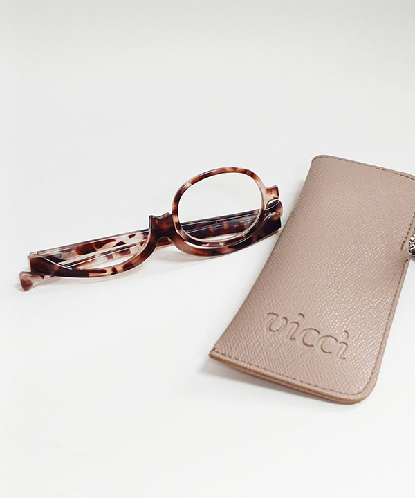

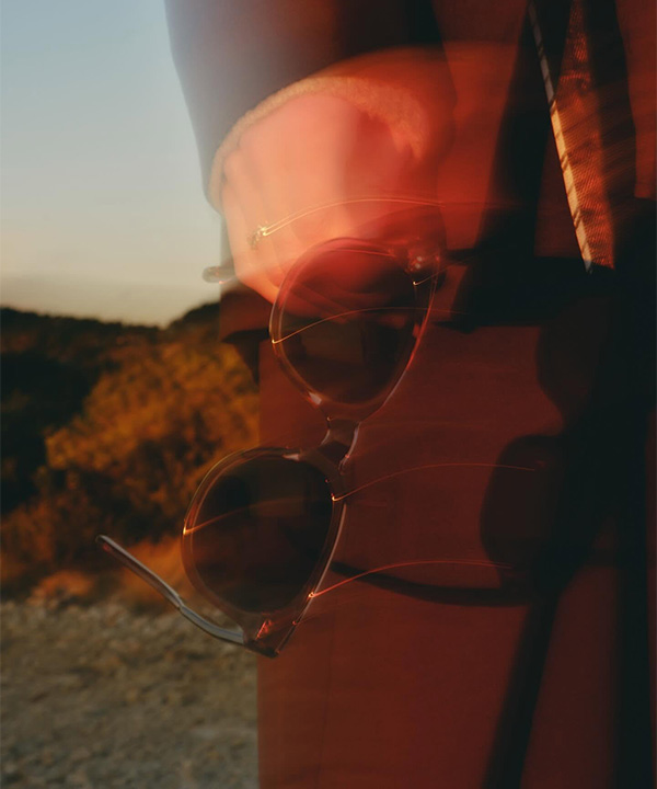
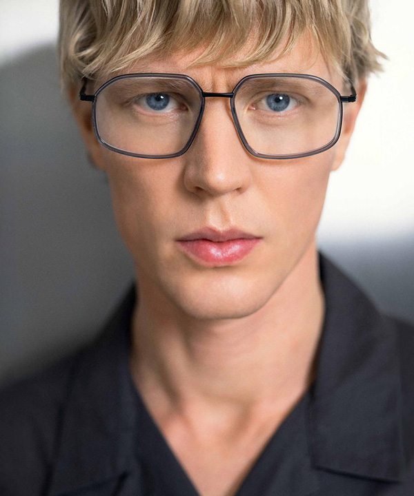
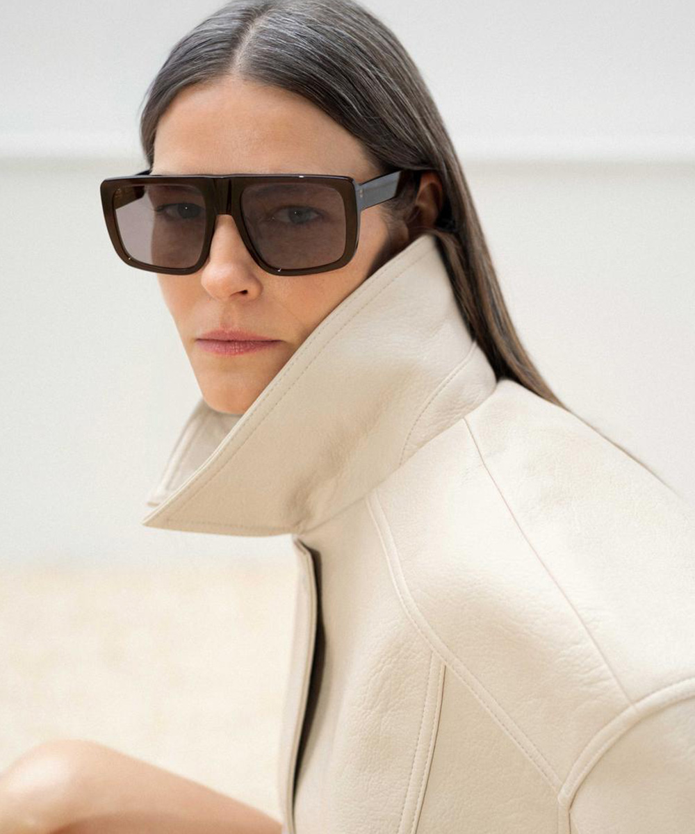
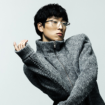
As the global optical industry turns to innovations in reading eyewear and lens technologies amid the growing population with near vision difficulties, niche and purpose-driven designs are opening new avenues in the market. One practical example with strong commercial potential is makeup readers, designed to overcome the ergonomic barriers women face during their beauty routines. Featuring rotating or flip-down mechanisms, these special designs offer practicality and comfort, particularly for women experiencing age-related near vision problems. By eliminating the need to move excessively close to the mirror, they enable safe and precise makeup application without losing focus. Once regarded as simple e-commerce accessories, makeup readers are evolving from a technical solution into a blend of fashion and functionality as design brands introduce them into their collections. Offered in high-quality acetate, with anti-reflective lenses, advanced technical features and a variety of colors, this niche product category also presents optical stores with an attractive opportunity for ‘second-pair’ sales and impulse purchases.

How Do the Mechanisms Work?
What sets makeup readers apart from standard reading glasses is the positioning of the lenses and the frame’s ability to move. Two main mechanical designs stand out in the industry to meet this need. The first is the single-lens ‘Swivel’ system, which rotates 180 degrees around a central pivot on the bridge. When applying makeup to the right eye, the user rotates the lens in front of the left eye to maintain a clear point of focus. However, hardware quality is crucial in these systems, as looseness in the mechanism may shift the optical center of the lens and affect user comfort. Swivel systems are therefore better suited to hyperopia or presbyopia than to astigmatism correction. In the ‘Flip-Down’ system, particularly favored in the premium segment, the two lenses operate independently. Micro hinges along the lower edge of the frame allow the lens in front of the eye being made up to fold downward, while the other eye continues to see the mirror clearly through the focused lens. The key advantage of Flip-Down systems for optical retailers is their structure, which allows pupillary distance adjustment and the fitting of prescriptions that include astigmatism.


From Inexpensive Aid to Luxury Accessory
Despite their high functionality, makeup readers were long overlooked by experienced opticians because they were available only as inexpensive injection-molded plastic products. Today, however, they offer commercial potential as an emerging niche segment. The design brands such as Miami-based Vicci Eyewear are among the first to transform this niche category from a purely functional accessory into a lifestyle object. The brand combines hypoallergenic, aspheric and anti-reflective lenses resistant to cosmetic chemicals with premium Italian acetate and monel metal frames. Bold shapes and rich color palettes further appeal to different aesthetic tastes. Hong Kong-based EYEisland, meanwhile, brings new alternatives to the segment with its colorful style inspired by the energy of street fashion. This growing diversity points to makeup readers becoming an enduring category in optical fashion.

Fresh Perspective for Your Store
While selling another pair of reading glasses to women with near vision loss, particularly presbyopia, may often meet resistance, offering a stylish yet functional beauty accessory that adds value to their makeup routine can help reduce hesitation toward a ‘second-pair’ purchase. Presented in elegant boxes and special cases, this new segment can also create an appealing ‘luxury gift’ option for your store. Addressing an important need in a more stylish and refined way, this niche segment promises a new experience for both you and your customers.

Eylül 2026

Studio Eyewear

Colourful Side of Scandinavian Design

STUDIO EYEWEAR

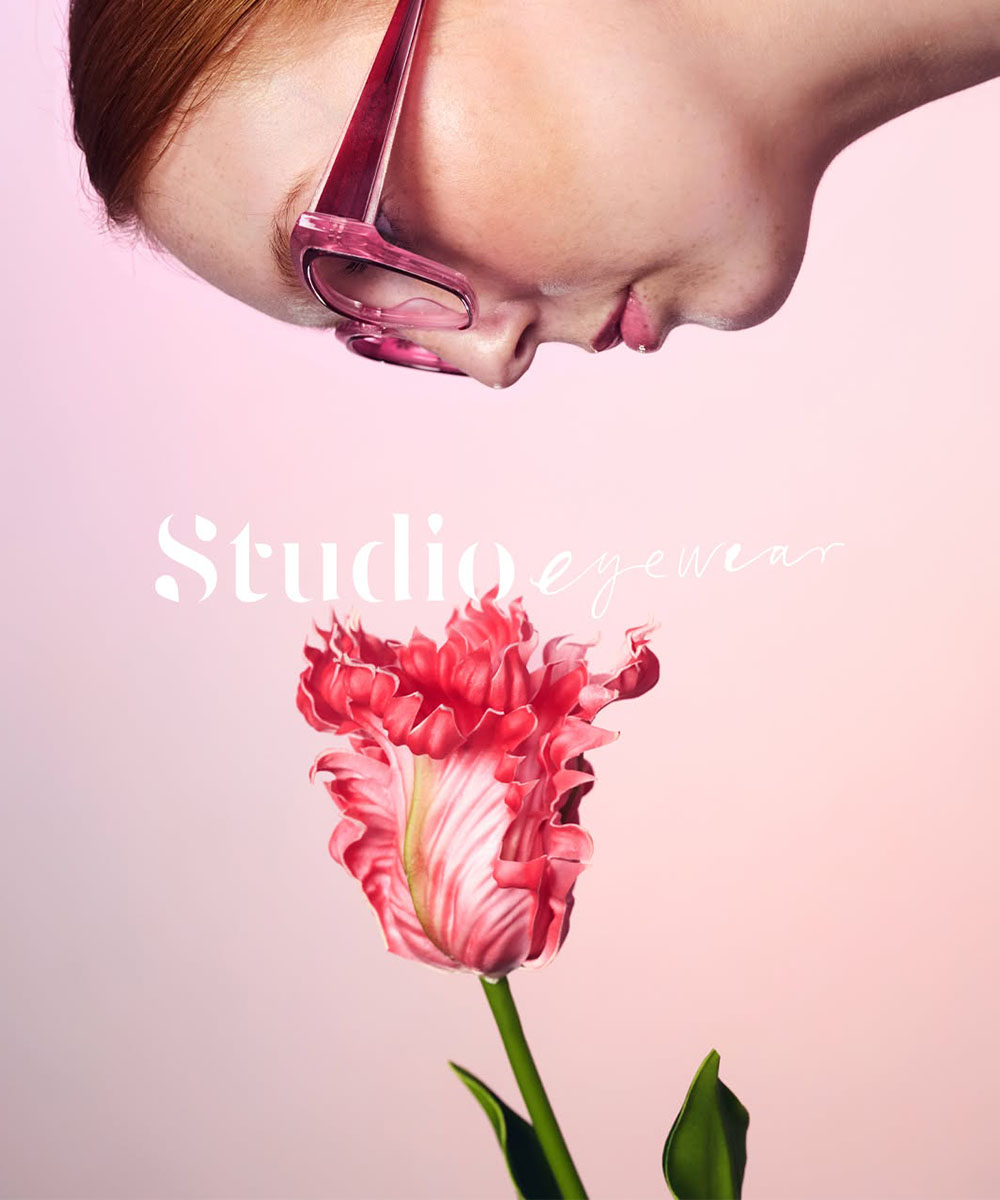
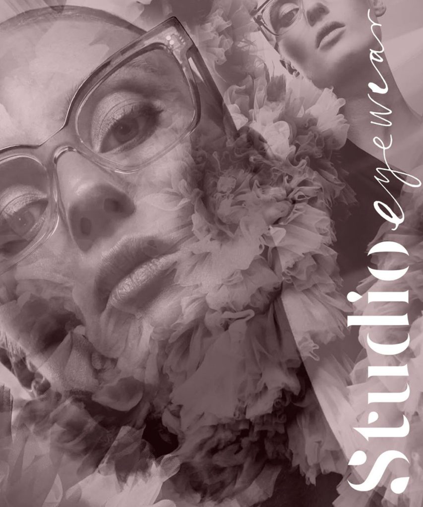
With its distinctive design philosophy, expressive collections and creativity centred on self expression, Sweden’s Studio Eyewear brings a fresh and colourful perspective to Scandinavian eyewear design.

Studio Eyewear represents a more colourful, expressive and imaginative interpretation of Swedish design, moving beyond the simplicity and functionality that Scandinavian aesthetics are often associated with. Born in the vibrant southern Swedish city of Malmö, the brand views eyewear not simply as an everyday essential, but as wearable art that reflects both personality and state of mind. Developed within the Swedish eyewear company Opo Scandinavia, founded in 1996, Studio Eyewear is led by Design Manager Anna Mälstad. Even the brand’s name reflects its creative philosophy. Rather than describing a finished design concept with fixed boundaries, “Studio” represents a living creative space where ideas evolve freely, inspiration shapes the process and unexpected discoveries can emerge. Backed by decades of eyewear design experience, the team brings an exceptional sense of colour and a distinctive aesthetic vision to every collection. Inspiration drawn from remarkable women, gemstones, travel and dreams is transformed into frames with an artistic, and at times almost surreal, character. At the heart of Studio Eyewear’s design philosophy is the confident woman who is unafraid to express herself, with every collection created around her needs and aspirations. Happiness is another defining element of the brand’s creative philosophy. Believing that eyewear should reflect both the wearer’s energy and individuality, just as garments do throughout the day, Studio Eyewear combines playful details with effortless elegance. Its ‘Be Happy & Express Yourself’ motto perfectly captures the spirit that runs through every collection. The brand’s design studio in Malmö also serves as a creative hub where local photographers, artists and fashion designers collaborate to bring the Studio Eyewear vision to life. As a result, the brand’s imaginative universe extends well beyond the frames themselves, evolving into a visual identity shaped by multiple creative disciplines. Premium Mazzucchelli acetate from Italy forms the foundation of every collection, complemented by silver or gold-plated metal components, while titanium is incorporated into selected models to introduce technical lightness and refined sophistication. Produced in limited editions, the collections are available exclusively through carefully selected optical retailers with extensive expertise in professional eye care.

Futuristic Aesthetics and Bold Details
Studio Eyewear’s Spring 2026 collection brings futuristic aesthetics together with expressive craftsmanship in a distinctive design language. Built around bold forms and refined detailing, the collection explores the contrast between titanium and acetate to create a look that feels both daring and sophisticated. Light becomes far more than a complementary element, emerging as one of the defining features of the collection. Glitter finishes, mother-of-pearl accents and holographic effects create ever-changing reflections that give the frames an almost luminous presence. The result is a collection that feels modern, playful and confidently individual. At the heart of the collection are four new models, each distinguished by its own character and design language. From sculptural aviator silhouettes to softly faceted feminine shapes, the designs balance striking visual impact with effortless wearability. Metallic details and newly developed titanium components bring depth and precision to each frame, while carefully considered decorative accents reinforce the unique identity of every design. One of the season’s defining innovations is the introduction of titanium into selected styles. Combining technical lightness with a contemporary sense of luxury, the material is paired with premium Mazzucchelli acetate and silver or gold-plated metal components, reflecting Studio Eyewear’s commitment to exceptional materials and meticulous craftsmanship.

Four Distinctive New Designs
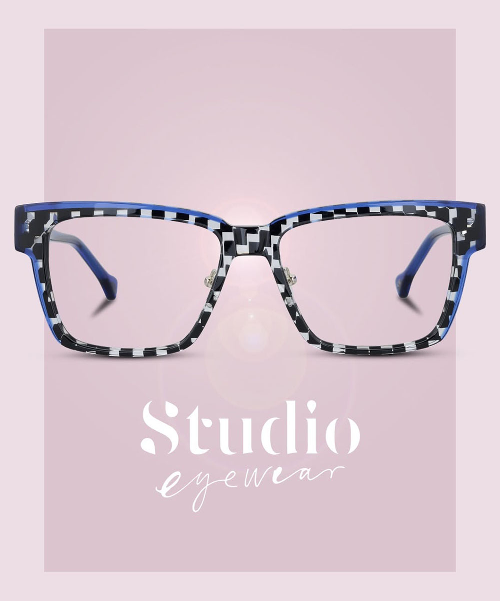
The Spring 2026 collection introduces four new models, each with its own unmistakable personality. Andromeda stands out with holographic glitter effects and metallic temple details, creating a striking presence that shifts beautifully with the light. Bellatrix takes a softer, more elegant direction, pairing an almond-shaped silhouette with refined faceting and delicate metal accents to create a confident feminine expression. With Cassiopeja, the Swedish brand reinterprets the classic aviator through a contemporary combination of titanium and acetate, while subtle mother-of-pearl details add depth and sophistication. Capella, meanwhile, embraces a more futuristic aesthetic through its floating titanium decorative element. This distinctive detail creates an illusion of lightness while lending the frame a precise architectural character.

New Capsule Collection for Autumn 2026
Studio Eyewear has unveiled its new capsule collection for the upcoming Autumn 2026 season. Continuing its exploration of the dialogue between past and future, the Swedish brand builds on the futuristic direction introduced in its Spring collection. Inspired by the optimistic Space Age aesthetic of the 1950s, the new capsule reinterprets the era’s forward-looking design language through a contemporary perspective. Sculptural silhouettes defined by bold proportions, expressive colour combinations and sophisticated acetate laminations bring nostalgic references together with modern design. The result is a collection of frames that feels as playful as it is refined, balancing echoes of the past with a distinctly contemporary character. Among the highlights of the capsule collection is Astrum, a model that combines striking patterns with confident shapes. Its design captures the experimental spirit of the era that inspired it through a contemporary graphic expression. Crafted from premium Mazzucchelli acetate and finished with silver or gold-plated metal details, the Autumn 2026 capsule balances exceptional materials with a distinctive visual identity. Altogether, the collection offers a compelling expression of Studio Eyewear’s creative vision, shaped by expressive design, meticulous craftsmanship and contemporary eyewear with unmistakable character.

Source: Spectr

August 2026

SALT.

Passion for Timeless Design, Sun and Sea

SALT.

While celebrating its twenty year design legacy through The 20 Year Collection, Salt. Optics brings the spirit of the California lifestyle to the Aegean coast with its new sunwear styles for summer.

Inspired by California’s natural beauty and a timeless design philosophy, Salt. Optics embarked on its journey 20 years ago and has since earned a respected place among the world’s leading independent eyewear brands. From the very beginning, the company has chosen to create enduring designs rather than follow passing trends, combining premium quality, comfort and simplicity through collections shaped by Japanese craftsmanship. One of the qualities that most clearly distinguishes Salt. from its peers is its ability to create understated collections that always carry a story worth telling. From the Pacific coastline and vast deserts to mountain landscapes and open horizons, California’s diverse geography serves as a constant source of inspiration for Salt.’s design language while also shaping the calm and refined character present throughout its collections. Rather than relying on exaggerated details to attract attention, the brand focuses on balanced proportions, exceptional materials and design decisions intended to retain their relevance for years to come. Through this approach, Salt. has successfully established a design identity that rises above seasonal trends and remains independent of fashion’s ever changing pace. Today, the brand is worn and appreciated in countries around the world, having remained faithful to the same design philosophy throughout the past two decades without compromising its commitment to quality. Brought to life in Japan through traditional craftsmanship and premium materials such as acetate and titanium, its collections give tangible form to the concept of timelessness that lies at the heart of the brand’s Dna. For Salt. Optics, eyewear is never simply a product created for a particular season. Instead, each frame is conceived as a lasting design object intended to be worn and appreciated for years to come.

20 Years of Timelessness
Rather than simply looking back on its past, Salt. marks this important milestone by reinterpreting the design philosophy that has shaped the brand’s identity from the very beginning. The 20 Year Collection revisits the bold silhouettes and high coverage designs that defined Salt.’s early years, bringing them into the present through a contemporary aesthetic while paying tribute to the brand’s two decades of design heritage. Blending Southern California’s iconic beach culture with the street style influences of the 1990s and the free spirited energy of the era’s surf scene, the collection reconnects with the design codes that helped establish the brand’s character. Salt.’s longstanding commitment to simplicity is reimagined through bolder forms and more assertive volumes, allowing The 20 Year Collection to celebrate the brand’s roots while presenting them through a distinctly modern lens. The result is far more than an anniversary release. It is a powerful design statement that captures the essence of Salt.’s twenty year journey. Produced in a limited edition, The 20 Year Collection consists of seven styles: Hatch, Atomic, Rapture, Graves, Shayla, Crue and Jahn. While each design draws inspiration from a different chapter of the brand’s history, they come together through a shared aesthetic language that reinforces the collection’s cohesive identity. Crafted in Japan using Japanese acetate and Japanese titanium, the frames reflect the quality standards and manufacturing precision that have defined Salt. for years. Custom hinge systems developed specifically for The 20 Year Collection, unique hardware details and commemorative 20th anniversary plaques integrated into the temple tips demonstrate that Salt. set out to create something far beyond a standard seasonal release. From premium materials to meticulous craftsmanship, every detail reflects the design culture and respect for craftsmanship that the brand has cultivated over the past two decades. Inspired by the past yet created for today’s wearer, The 20 Year Collection once again demonstrates why Salt. continues to hold such a distinctive and respected position within the independent eyewear world.

Highlights from the Anniversary Collection
Among the standout designs in the anniversary collection, Crue emerges as a bold titanium frame that combines a performance driven approach to protection with a classic aviator silhouette. Its wider coverage and face wrapping construction give the model a dynamic presence, while its clean lines and balanced proportions remain true to Salt.’s timeless design philosophy. Successfully balancing technical performance with everyday wearability, Crue reflects the collection’s ability to draw inspiration from the past while meeting the expectations of today’s wearer. Jahn, meanwhile, represents a more understated, refined and measured side of the collection. Crafted entirely from titanium, the model stands out through its clean lines inspired by 1990s California lifestyle. With its understated character, Jahn embodies Salt.’s design philosophy while bringing together lightness, comfort and elegance in one harmonious design. As a result, it stands as one of the collection’s most balanced interpretations.

Shayla, the collection’s dedicated women’s sunglass design, takes a bolder and more sculptural approach. Reimagining the classic sport inspired silhouette through a distinctly feminine lens, the model pairs generous proportions and flowing curves with enhanced coverage, making it one of the most striking designs in the collection. Its oversized structure softly frames the face while creating a look that feels both confident and sophisticated. The remaining sunglass styles, Atomic, Graves, Rapture and Hatch, explore the collection’s shared design language from different perspectives. Drawing on the design heritage of Salt.’s formative years while embracing a contemporary aesthetic, these models reinforce the collection’s identity through strong forms, face wrapping silhouettes and distinctive details. Together, they form a cohesive selection that reflects both the brand’s twenty year design legacy and its enduring independent spirit.

Sun, Sea and Salt.
Carrying the sunshine and coastal spirit of its birthplace at the heart of its identity, Salt. Optics celebrates its 20th anniversary season with a special sunwear selection. Featured in the brand’s campaign imagery captured along the Aegean coast of Greece, the new styles Max, Millerton and Ross reaffirm the enduring influence of the sea and summer sun on Salt.’s design philosophy. One of the highlights of the Summer 2026 collection, Max reinterprets the glamour of 1950s Hollywood through a contemporary lens, while Millerton updates the classic lines of 1960s eyewear for today’s wearer. Crafted from Japanese titanium, Ross brings together lightness, durability and understated elegance in a refined expression of the brand’s design approach. Through its 2026 collections, Salt. successfully demonstrates that its distinctive design language and commitment to timelessness will continue to shape the brand for years to come.

July 2026

Kaleos

Character Takes Center Stage

Kaleos

Known for its contemporary designs built around form, proportion, and facial expression, Spanish eyewear brand Kaleos carries its strong 2026 momentum into summer with Variations, a capsule collection created in collaboration with actor Javier Rey.

Founded in Barcelona in 2013, Kaleos quickly established itself as one of the most distinctive names in global eyewear fashion through its independent design perspective. Blending fashion, craftsmanship, and contemporary design into a singular creative language, the brand has developed a strong aesthetic identity that moves beyond conventional eyewear. For Kaleos, glasses are not simply accessories that complete a look. They are style elements that directly shape character and expression. This approach is strongly influenced by the vision of Creative Director Claudia Brotons, whose background in fashion continues to define the brand’s creative direction. Built around proportion, silhouette, and facial expression, this design philosophy allows Kaleos collections to evolve with an increasingly powerful fashion identity each season. For the 2026 Spring/Summer season, Kaleos pushes this vision even further. While the women’s and men’s collections reinterpret the idea of form through new proportions and refined structures, the summer-focused Variations capsule stands out as one of the clearest reflections of the brand’s current fashion perspective. Alongside the technical precision that continues to attract attention across the optical industry, Kaleos is also emerging as one of the season’s strongest names through a design language centered on modern fashion aesthetics. Each frame undergoes an extensive development process of nearly 18 months, supported by custom acetate blends, carefully refined color selections, and handcrafted finishing details. Together, these elements position Kaleos as a brand that does more than follow trends. It continues to build a visual language entirely its own.

New Silhouettes Shaped by Form
Kaleos’ 2026 Spring/Summer women’s collection introduces a freer and more experimental energy to the season. Built around movement, contrast, and a strong exploration of form, the collection places silhouette at the center of its visual identity. Compact structures, bold oval shapes, sharp transitions, and unexpected proportions define the overall atmosphere. Frames that accentuate facial contours bring a distinctly fashion-driven attitude to the collection, reinforcing Kaleos’ growing presence within contemporary eyewear fashion. In several models, soft curves merge with geometric edges within the same structure, pushing the brand’s controlled design language toward a bolder direction. As layered lamination details move into the background, form becomes more visible and more assertive, while color takes on a clearer and more character-driven role. Transparent transitions, glossy surfaces, and subtle shimmering accents introduce a sense of movement throughout the collection. One of the strongest aspects of the line is its ability to balance contrasting attitudes within a cohesive visual language. While some frames lean toward a more expressive and fashion-forward direction, others embrace a quieter and more refined aesthetic. Fine metal details, semi-rimless constructions, lightweight structures, and photochromic lenses strengthen the technical side of the collection. Yet the designs never feel overly technical. Kaleos transforms engineering details into a natural extension of style rather than placing them at the forefront. Another defining aspect of the women’s collection is the way the frames interact with facial expression. Some models create a stronger and more assertive presence, while others offer a calmer yet more sophisticated character. Rather than designing for a single type of woman, Kaleos builds a collection language that allows space for different face shapes, personal styles, and fashion attitudes. This approach prevents the collection from feeling like a temporary seasonal statement. Instead, it creates a stronger and more lasting sense of style.

Architectural Precision and a Modern Masculine Line
For the 2026 Spring/Summer season, the Kaleos men’s collection moves toward a more controlled, architectural, and refined direction. Built around the theme “Unexpected Twists,” the collection explores how subtle design interventions can completely transform the overall appearance of a frame. This philosophy of controlled evolution rather than rigid structure can be felt throughout the collection. One of the first elements that stands out across the men’s models is a strong sense of clarity. Sharp lines, balanced proportions, and defined geometric constructions shape the foundation of the collection. Rather than creating a loud or overly assertive masculine aesthetic, Kaleos embraces a quieter yet more confident design language. Models crafted from high-density acetate deliver a strong visual presence despite their lightweight structures, while matte surfaces and crisp edge detailing reinforce the collection’s technical character. Several frames feature hybrid constructions that combine acetate with stainless steel, introducing an added sense of structural sophistication. Screwless hinge systems and titanium-supported builds further highlight Kaleos’ engineering-focused approach. Yet despite these technical developments, the collection never feels cold or overly industrial. A refined balance is maintained throughout, reflecting the rhythm of contemporary urban life. The use of proportion is another key strength within the collection. Selected models are offered in two different sizes, emphasizing the brand’s attention to user experience while allowing the designs to reach a broader range of wearers.

Variations and the New Mood of Summer
Created specifically for the SS26, the Variations capsule stands among the clearest expressions of Kaleos’ approach to design. Developed in collaboration with Spanish actor Javier Rey, the collection centers on the impact that subtle design changes can have on the overall character of a frame. Throughout the collection, proportions, surfaces, colors, and detailing are carefully reinterpreted through a controlled design perspective. Rather than relying on exaggerated design gestures, the Variations capsule favors more measured interventions. Classic silhouettes are reshaped through subtle adjustments, while the combination of matte and glossy acetate surfaces adds greater visual depth to the collection. The color palette remains calm and understated, yet the frames maintain a strong sense of character. Among the collection’s most distinctive elements are the photochromic lenses, which shift into different tones under the summer light. Javier Rey’s restrained and natural presence throughout the campaign imagery also aligns seamlessly with the overall atmosphere of the capsule. Far from theatrical, this approach reinforces the collection’s understated yet impactful understanding of style. Instead of creating a fashion language that seeks attention through excess, Kaleos proposes a look that feels calmer, more controlled, yet unmistakably confident in character. This is precisely where Kaleos reveals its strongest quality throughout the SS26 season. The brand never places technical quality behind fashion aesthetics. Instead, it establishes a strong balance between design language and engineering precision. With the Variations capsule presented alongside its women’s and men’s collections, Kaleos once again proves itself to be one of the most compelling independent names in contemporary eyewear fashion.

June 2026

Ic! Berlin

30-Year Signature in Steel

Ic! Berlin

Widely recognized for its expertise in stainless steel eyewear and its patented screwless hinge, German brand ic! berlin marks its 30th anniversary with a dedicated capsule collection and a striking campaign.

ic! berlin has never needed excess to make a statement. For three decades, the Berlin-based brand has built its reputation on precision, restraint, and a radical commitment to engineering purity. Now, as it marks its 30th anniversary, ic! berlin does what it does best. It refines, sharpens, and elevates its core language through a tightly curated collection that connects past and future with quiet confidence. Marking three decades of radical design thinking and uncompromising engineering, ic! berlin’s 30th anniversary collection arrives not as a retrospective, but as a confident continuation of a design philosophy that has always resisted convention. Rooted in Berlin’s culture of reinvention, the collection channels the brand’s signature clarity of purpose into a tightly edited yet conceptually rich capsule that bridges heritage and forward-thinking innovation.

Stainless Steel in the Spotlight
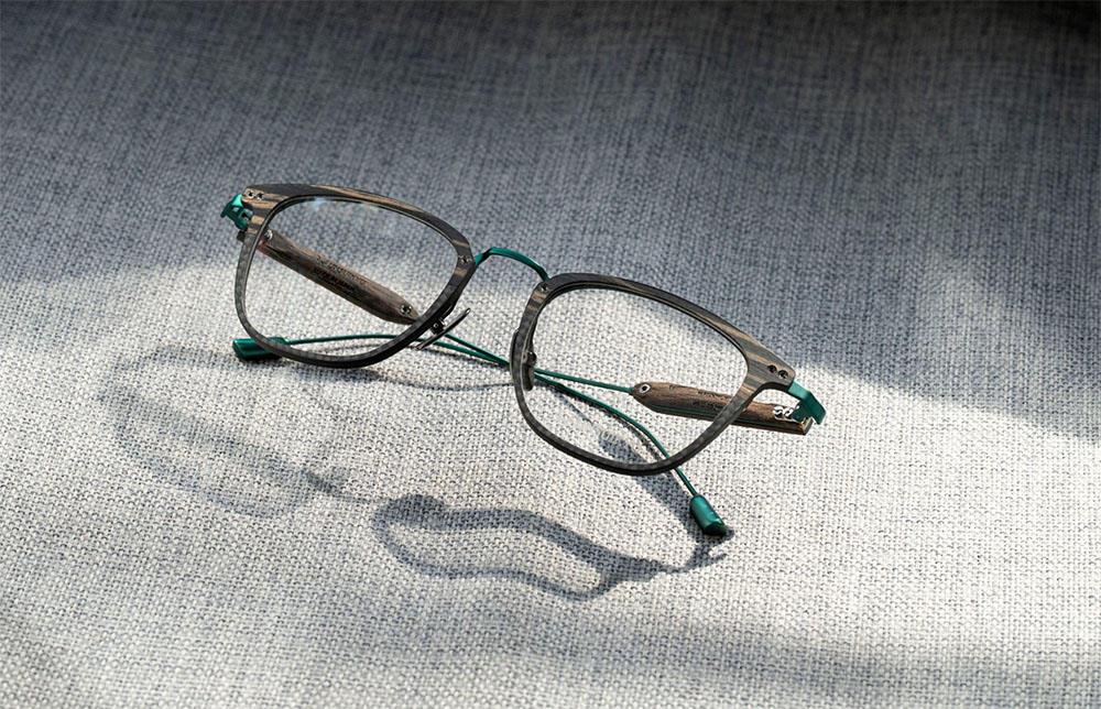
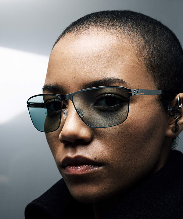
At its core, the anniversary release is an exercise in reduction and refinement. Rather than overwhelming with novelty, ic! berlin leans into its most defining strength: the purity of material and construction. Stainless steel, cold-rolled to achieve both resilience and remarkable lightness, once again takes center stage. The brand’s iconic screwless hinge, still unrivaled in its precision and durability, remains the silent hero across the collection, delivering a seamless fusion of engineering and aesthetics. The capsule itself is built around a thoughtful dialogue between past and future. Four heritage-inspired models, Leif, Wanda, Oli the 2nd, and Pina, reintroduce the silhouettes that helped define the brand’s visual language, while two new designs, Sodium and Xenon, push that language into a more contemporary, technically expressive territory. This interplay creates a rhythm within the collection: familiar yet reinterpreted, restrained yet forward-moving. A defining visual anchor of the collection is its commitment to the essence of steel. Eschewing excessive coatings or artificial finishes, ic! berlin embraces natural treatments that elevate the intrinsic beauty of polished metal. The result is a surface quality that feels honest and enduring, allowing the material itself to age gracefully alongside the wearer. This approach reflects a broader design ethos: eliminate the unnecessary, celebrate the essential. Within this refined framework, the introduction of Transformative Teal injects a subtle yet striking layer of expression. Positioned between blue and deep green, the shade carries a duality that mirrors the collection’s intent, calm yet energetic and grounded yet directional. It is not merely a color choice, but a narrative device, symbolizing change, evolution, and the quiet confidence of a brand that knows exactly where it stands. This chromatic identity extends seamlessly into the lenses. Photochromic technology, carefully matched to the Transformative Teal tone, enhances both functionality and visual cohesion. The lenses transition effortlessly between indoor clarity and outdoor protection, reinforcing the idea of adaptability without disruption. It is a detail that speaks directly to ic! berlin’s understanding of real-world wearability: intelligent design that responds intuitively to the user’s environment.

Styles Celebrating 30 Years
Rather than leaning on nostalgia, ic! berlin focuses on clarity in the designs featured in its 30th anniversary capsule. In the sun category, each model carries a distinct personality while remaining firmly anchored in the brand’s minimalist Dna. Oli the 2nd revisits a beloved silhouette with a sport-driven edge, where the interplay of stainless steel and photochromic lenses underscores its dynamic character. Pina, by contrast, introduces a more expressive sensibility, its rounded front softened by a delicate brow-like metal detail and nuanced color transitions that add emotional depth. Xenon, one of the collection’s new entries, distills the concept of minimalism to its purest form. Its rectangular structure and flat profiles emphasize material integrity, while the refined temple design adds a quiet sophistication. The optical segment continues this narrative with equal precision. Leif stands out with its assertive lines and robust construction, amplifying the technical clarity of the screwless hinge system. Wanda offers a more fluid interpretation, balancing boldness with femininity through its interplay of shapes and thicknesses. Meanwhile, Sodium introduces a distinctly modern perspective, defined by its purposeful geometry and double-thickness front that lends architectural depth to the frame. Each model reflects a different facet of ic! berlin’s design intelligence, yet all remain unmistakably part of the same language. Through every style in the capsule, the brand demonstrates that true innovation is not only about reinventing from scratch, but also about taking what works and pushing it further.

I See Berlin: Capturing the City’s Spirit
The brand’s 30th anniversary gains meaning not only through its special capsule, but also through the powerful visual narrative of the ‘I See Berlin’ campaign. Moving beyond a conventional brand story, the campaign places Berlin’s ever-evolving, restless spirit at its core. Created by visual storyteller Tarek Mawad, I See Berlin brings together striking portraits that blur the line between documentary and artistic interpretation. Each frame captures not only faces, but also attitudes, identities, and layered personal stories with a compelling sense of expression. Artists, performers, and thinkers appear not as brand ambassadors, but as natural extensions of Berlin’s cultural pulse. From legendary nightlife figure and photographer Sven Marquardt to Michelin-starred chef Dalad Kambhu, the cast reflects the many layers of the city’s creative identity. Rather than polished perfection, I See Berlin embraces a raw and unfiltered sense of individuality, portraying a vibrant city defined by contrasts, resilience, and constant reinvention. Digital animation layers, created in collaboration with artist Leif Podhajsky, add a further dimension, referencing Berlin’s alternative art and cultural scene. Subtle distortions and fluid transitions within the frames draw the viewer in, making each image more immersive. Within this dynamic and ever-shifting structure, ic! berlin eyewear is positioned not merely as a product, but as both a tool and a metaphor, functioning as a lens through which the city can be seen, interpreted, and redefined. Bringing product, place, and perspective together within a cohesive narrative, the campaign demonstrates that ic! berlin continues to carry the dynamic and inspiring spirit of the city with the same deep commitment it has maintained for 30 years.

May 2026

Andy Wolf

Celebrating 20 Years

Andy Wolf

The Blown Into Bloom campaign, balancing design, nature and people, expresses
Andy Wolf’s brand values shaped over 20 years through a powerful visual narrative.

Andy Wolf has established a strong presence in the optical world for 20 years, standing out not only through its design but also through its distinctive brand stance. Founded in 2006 by Andreas Pirkheim and Wolfgang Scheucher, the brand has, from the very beginning, pursued a clear vision of combining local eyewear craftsmanship with a contemporary and innovative design approach. Today, present in many parts of the world, Andy Wolf has refined this philosophy over time, creating a design language that is distinctive, clear, and instantly recognizable. The brand’s direct, honest, and understated way of communication runs parallel to the clarity and precision of its designs, while this sincere attitude resonates strongly on a global scale. Andy Wolf’s steady rise can be attributed not only to its aesthetic choices but also to the international recognition of its consistent brand identity. Behind this strong identity lies a sense of cohesion and meticulous attention that is evident at every stage, from design to production. The fact that all frames are 100 percent handmade, that materials are selected according to the highest quality standards, and that production takes place in Austria and France are among the clearest indicators of Andy Wolf’s commitment to craftsmanship. The combination of traditional production techniques with a modern design language gives the brand a high level of recognition, while allowing its designs to speak for themselves without the need for a visible logo. The brand’s sensitivity to sustainability and regional production also stands out as an integral part of its identity, with every detail, from material selection to the supply chain, reflecting consciously made decisions. With its 20th anniversary, Andy Wolf demonstrates that, through its stance, signature collections, and environmental and social responsibility projects, it will continue to be among the brands that stand out in the global optical industry in the years ahead.

Celebrating 20 Years | Blown Into Bloom
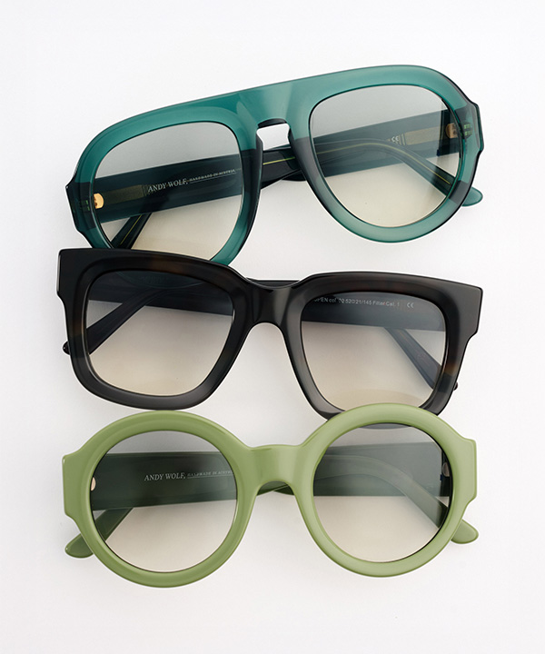
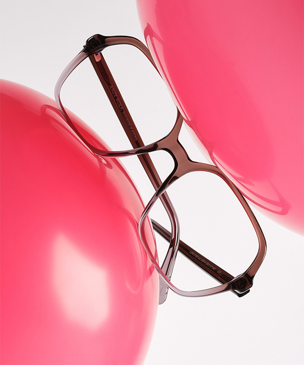
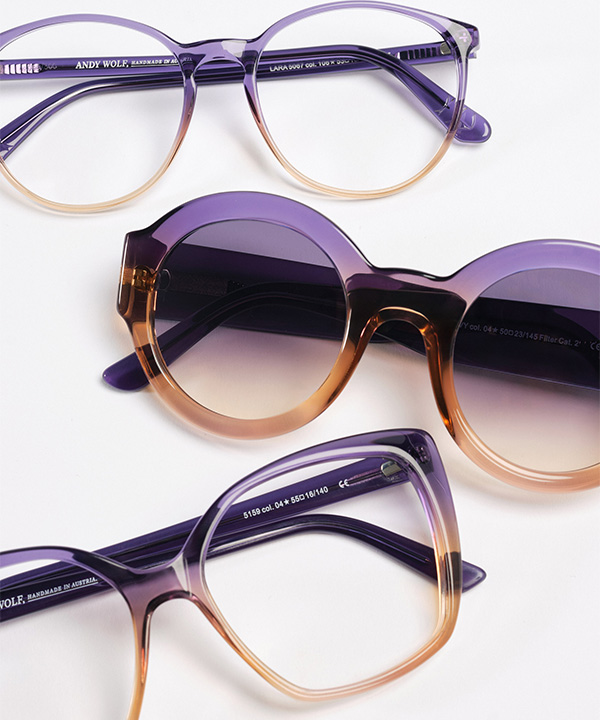
For two decades, Andy Wolf has stood out with strong shapes, vibrant colors, and a design language defined by character, presenting a confident approach in its anniversary collection that carries this legacy into the future. The Blown Into Bloom collection reflects the brand’s ability to remain true to its roots while moving forward with a contemporary vision. The heritage of the past, the aesthetics of today, and a forward looking perspective come together in a balanced way within this collection. The result is an aesthetic that feels timeless, authentic, and highly expressive. At the core of the collection are vintage inspired frames. These classic references, however, are reinterpreted through modern touches and adapted seamlessly to today’s design sensibility. One of the most striking examples of this approach is the ring in ring concept seen in the Laurel, 4845, and 4846 models. Created by fusing two layers of acetate, this technique introduces a frame within a frame effect, adding depth and sculptural volume to the designs. Other standout models highlight a thoughtful balance of materials. As seen in models 4642 and 4844, bold and substantial acetate structures are paired with fine metal details to create a refined contrast. The oversized oval 4840 model, strongly influenced by retro aesthetics, brings classic elegance into a modern context. In the sunglasses category, the Paris model emerges as one of the most striking pieces of the Blown Into Bloom collection. Moving away from the narrow silhouettes that have dominated in recent years, its wide and expressive form delivers a strong statement with effortless confidence. Color choices within Andy Wolf’s 20th anniversary collection also stand out as one of the defining elements of the designs. Triple gradient transitions such as Future Dusk combine beige, pink, green, purple, and blue to create a vivid sense of depth. Combinations such as purple and cream with pink accents, plum with fuchsia, and black and grey paired with cocoa and butter yellow bring distinct character and energy to the Blown Into Bloom designs.

Visual Expression of a Philosophy
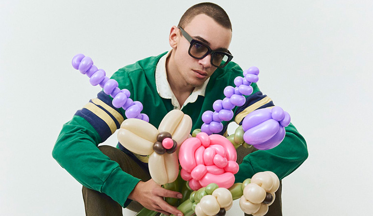
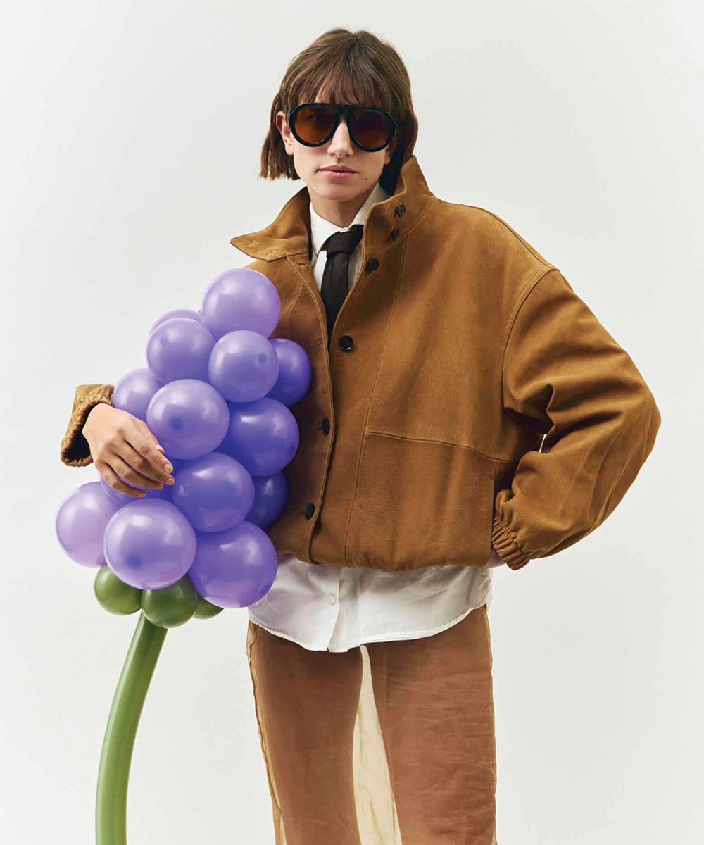
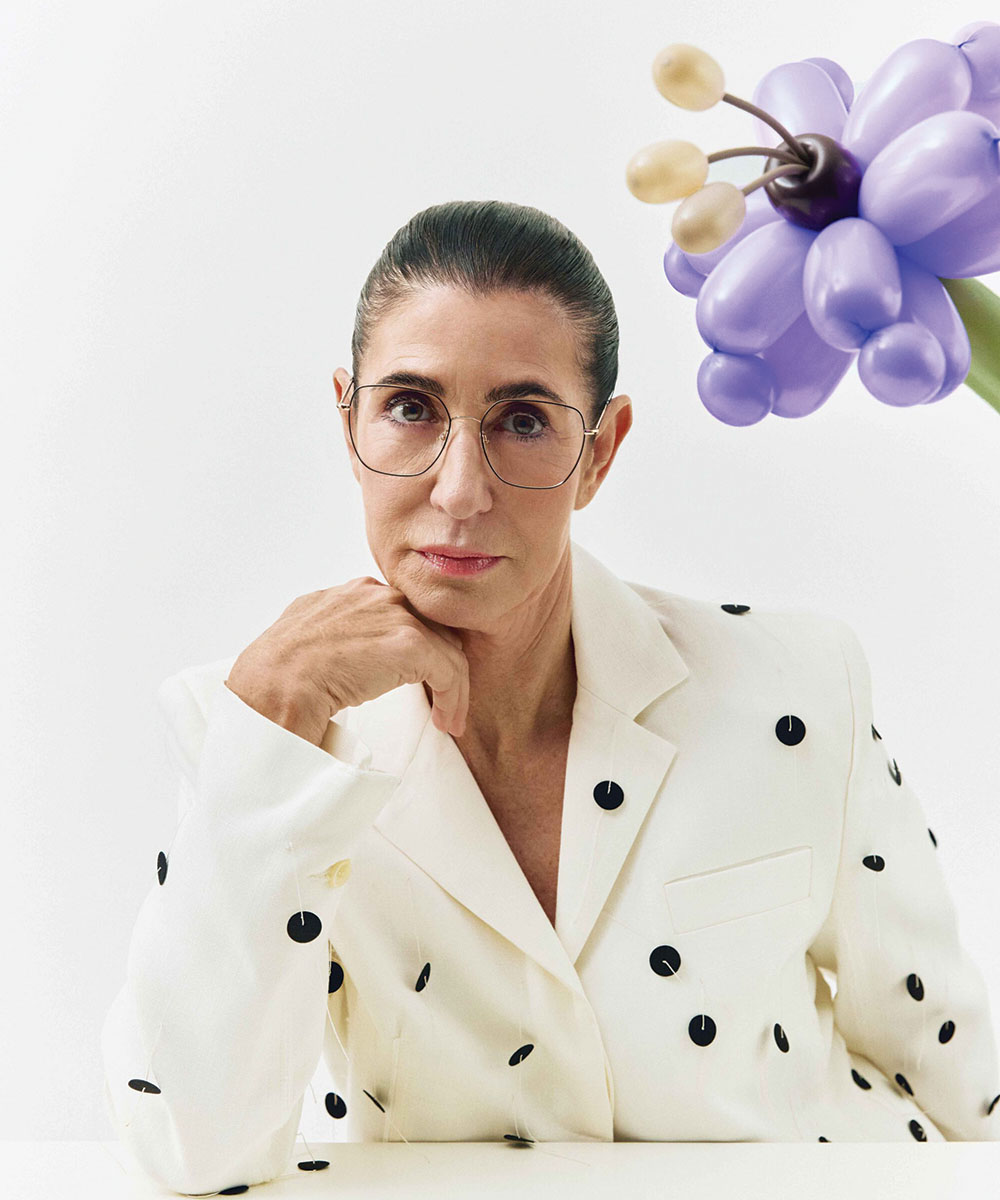
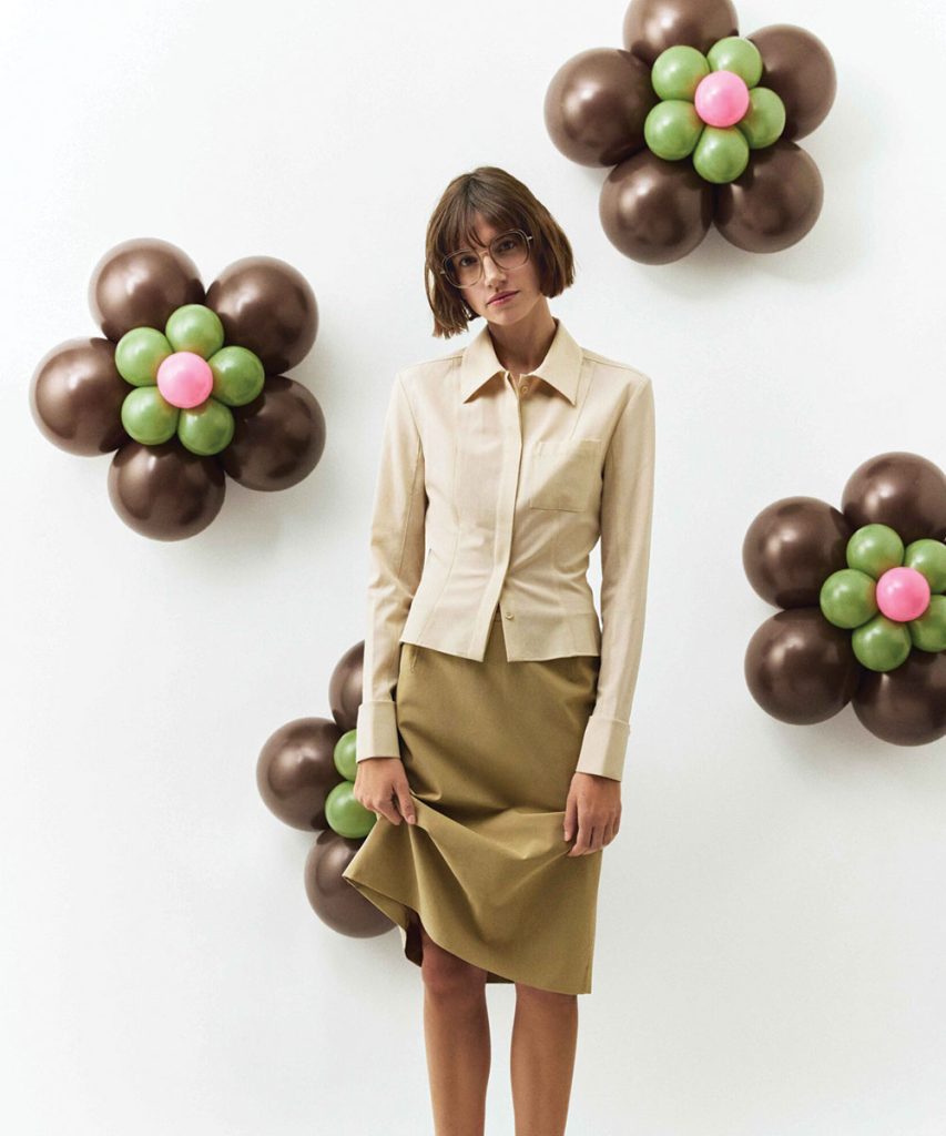
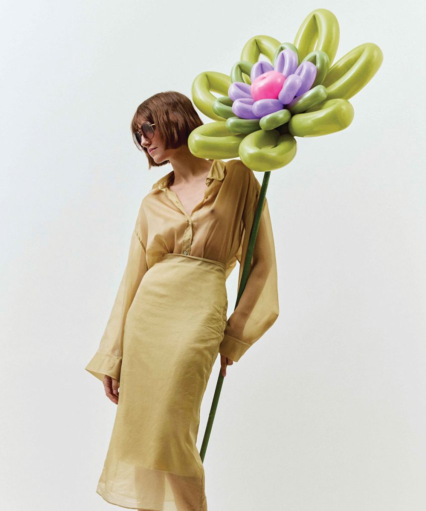
Andy Wolf’s Blown Into Bloom campaign presents not only the brand’s aesthetic world but also the set of values it has shaped over the past 20 years through a strong and compelling narrative. The sustainability approach introduced by the Austrian brand with its Grow With Us initiative in 2022 is carried to a much more visible, holistic, and mature level within this campaign. While the brand continues to honor its commitment to restore one square meter of wildflower meadow for every frame sold, it treats this idea not merely as a responsibility project but as an integral part of its creative identity. At this point, Blown Into Bloom reinterprets Andy Wolf’s vision of growth, transformation, and coexistence through a visual and emotional language. The sculptural, flower shaped forms created in collaboration with a balloon artist may at first appear digitally constructed, yet their entirely real production emphasizes the brand’s connection to authenticity. These floral elements are not only aesthetic features but also symbols of a relationship with nature, an evolving ecosystem, and a sense of collective creation. The wildflower meadows brought to life around the brand’s headquarters in Austria provide a natural habitat for birds, insects, and other species, while clearly reflecting a production philosophy that moves in harmony with nature. Details such as the bee colonies that have become part of this ecosystem and the honey produced from them add a sincere and human dimension to Andy Wolf’s approach. In this sense, Blown Into Bloom is not simply an anniversary campaign but can be read as a meaningful expression of a philosophy that began with Grow With Us. The delicate balance established between design, nature, and people brings together the brand’s creative and ethical stance within the same framework. Through the Blown Into Bloom campaign, Andy Wolf demonstrates that it is not only a brand that designs eyewear but also one that creates and sustains meaningful values.

Source: Spectr

April 2026
Sunday Somewhere Eyewear

Styles as Warm as the Australian Sun

Sunday Somewhere Eyewear

Celebrating the 15th anniversary of its distinctive journey among independent design brands with a sophisticated sunglasses collection, Sunday Somewhere reinterprets the spirit of the 1970s for today while drawing color inspiration from the Ionian Sea.

Founded in 2010 by Australian designer Dave Allison, Sunday Somewhere Eyewear is not only an eyewear brand but also a way of life. Whether inspired by curiosity or the desire to travel, the brand places the belief that the human urge to explore can never be fully satisfied at the center of its Dna. Creating designs for dreamers, explorers and those who keep their sense of curiosity alive, Sunday Somewhere was born under the Australian sun and blends past and future through its own refined aesthetic language. The brand presents meticulously crafted collections that combine vintage inspired frames with premium materials and details that shift between contemporary and futuristic expressions. Produced with careful attention to the finest details, Sunday Somewhere eyewear guarantees a high level balance between durability and style. Under the leadership of Dave Allison, the design team approaches eyewear through a broad perspective extending from vintage influences to high fashion, from travel experiences to futuristic movements. The collections feature striking reinterpretations of classic aviator models, experimental proportions and bold dimensions, alongside classic silhouettes reconstructed with modern touches. Architectural influence reveals itself through clean and precise lines that complement the wearer’s facial features with balance and harmony. As an independent eyewear brand, Sunday Somewhere quickly gained global recognition thanks to its focus on quality craftsmanship and bold design starting with its very first collection. The preference for Sunday Somewhere designs by numerous celebrities including Beyoncé, Bella Hadid, Kaia Gerber, Vanessa Hudgens, Jennifer Lopez, Whitney Port, Nina Dobrev and Candice Swanepoel, from red carpet appearances to street style moments, made a significant contribution to strengthening its identity as a fashion brand and expanding its international visibility. Seeking to broaden its distribution network, the Australian brand signed an agreement with Westgroupe last year, reinforcing its presence particularly in the United States and Canada. The first launch of this collaboration introduced a women’s collection consisting of 18 optical frames crafted from Mazzucchelli acetate and titanium. With this series, the brand created resonance not only across the American continent but also within the global optical fashion scene.

Taking You to the Ionian Coast
Marking the 15th year of its journey among independent design brands with a distinctive perspective and models that have already reached iconic status, Sunday Somewhere Eyewear welcomed the new year by introducing a sunglasses collection that carries forward the legacy of its 2025 optical series while serving as its continuation. Consisting of 18 designs, the collection reflects the brand’s characteristic aesthetic, bringing together a strong and expressive identity with craftsmanship inspired by the 1970s. The models stand out with the iconic palm tree logo placed at the temple tips and durable hinge constructions designed for long lasting comfort. The SS monogram featured on the lenses adds a refined signature detail to the designs. Produced using premium acetate and stainless steel, the sun collection presents striking silhouettes in oversized square, structured cat eye and round forms. The color palette that defines the spirit of the collection draws inspiration from the light reflections of the Ionian Sea and the natural allure of crystal textures. Presented with rich tones, energetic patterns and colorful lens options, the new designs succeed in becoming a choice of trendsetting names.

Dance of Form, Color and Materials
Sunday Somewhere’s new sun collection reveals, upon closer look, a diverse interplay of forms, colors and materials that integrate seamlessly both with one another and with the optical series. Opal introduces a slim, tapered cat-eye rendered in fine-quality acetate, defined by clean lines and a universally flattering silhouette. Sleek and lightweight with a whisper of nineties style, it lends understated cool to the edit. Forest Multi Havana and Tortoise Red ground the palette, each featuring the collection’s crystal-inspired temple detailing. Black Crystal heightens this effect, pairing a transparent temple front that gradually transitions into a tortoise pattern at the tip. The look is dimensional and aligned with the collection’s crystalline influences. Petunia unfolds with an exaggerated, rounded geometric form, designed for the boundary-pushing wearer who loves to stand out and treats fashion as a true expression of self. Daring, glamorous, and sculptural, it commands attention with ease. Multi Havana blends shimmering purples, greens, and muted neutrals for a gleaming, jewel-like finish. Black Havana and Purple Havana continue the palette with rich tones that intensify their dramatic profile. Durable rivet hinges adorned with the iconic palm tree logo complete the frame with a distinctive hallmark detail. Olive sets the tone for Sunday Somewhere’s sun debut with an oversized flat-top aviator shaped in premium acetate. Burgundy Blue leads the palette, pairing warm-tinted lenses with vibrant two-tone colorplay for a confident, contemporary statement. Teal and Black expand the story with saturated finishes refined by the brand’s signature accents, with the palm tree emblem finely embossed on the durable rivet hinges, decorative end caps, and temple tips. Peony transforms the classic aviator with a modern, fashion-forward lens. Slim, sculpted acetate forms its clean structure, while a softly contoured brow bar introduces gentle definition. Tailored proportions flatter narrower face shapes yet retain a sense of polished boldness. Colourways include Tortoise Terracotta, and Black Multi, each elevated by a rivet hinge finely detailed with the palm tree logo, underscoring the meticulous craftsmanship at the heart of the brand’s design philosophy. On the other hand Andy is constructed in stainless steel and infused with vibrant color lenses. Linear temple detailing and the SS monogram nose pads sharpen its minimalist identity. Effortlessly cool with a relaxed sophistication, Andy moves seamlessly from sunlit coastlines to polished city dressing. Finishes include Gold, Copper, and Silver. Suja II modernizes old Hollywood glamour for today’s style-conscious wearer. Its delicate geometric construction is crafted in stainless steel for a weightless feel. Intricate textural detailing across the frame, shaped by carved edges and gentle contours, lends the design a quiet depth. Along the temples, pressed-leaf motifs highlight the artistry and texture that define the style. Rose Gold introduces a luminous sheen paired with blue rose gradient lenses for a sophisticated contrast, while Gold offers a radiant alternative with caramel brown ombre lenses.

Source: The Optical Journal

March 2026

Unsuikyo Eyewear

Designs That Move Beyond Seasonal Trends

Unsuikyo Eyewear

Inspired by nature, cultural symbolism, and a deep rooted tradition of craftsmanship, the brand invites wearers into a sense of calm with its latest
award winning collection, Scion.

Unsuikyo Eyewear is a Hong Kong based eyewear brand guided by the principles of stillness, balance, and quiet strength. Drawing inspiration from nature, cultural symbolism, and a long standing craft tradition, the brand offers designs built on longevity and a vision that moves beyond seasonal trends. Although rooted in Hong Kong, Unsuikyo works closely with Japanese manufacturing expertise, bringing refined engineering together with a carefully considered aesthetic approach. The brand stands out for its ability to translate natural forms and historical references into contemporary eyewear through a clean and restrained design language. Nature inspired surface textures, precise metal detailing, and subtle references to traditional warrior attire are integrated into the designs without excess. Each collection reflects the values of patience, discipline, and harmony that sit at the core of Unsuikyo’s design philosophy. Inspired by the tranquil forest landscapes of the Shiratani Unsuikyo region, Unsuikyo Eyewear is handcrafted with the aim of deepening the connection between wearer and nature. Founded by eyewear designer Chan Ho Yin Brian, the brand is known for its award winning designs that reinterpret classic and vintage eyewear forms while incorporating natural materials such as sedimentary rock and wood. Unsuikyo’s aesthetic is not nostalgic, but positioned within a timeless framework. It brings together comfort, fit, and a distinctive way of seeing the world. Nature, however, is never treated as a purely visual reference.

Scion | Proportion, Weight & Tactile Balance
Within an industry driven by speed, novelty, and instant impact, Unsuikyo’s latest collection, Scion, consciously moves in the opposite direction. The collection draws inspiration from Jomonsugi, the ancient cedar that has stood for more than a thousand years in the mist covered forests of Yakushima Island in Japan. The strength of this tree comes not from forceful endurance, but from patience, adaptability, and an existence shaped over time. Scion carries the quiet strength of Jomonsugi into contemporary eyewear designs shaped by Japanese craftsmanship. Each piece is more than a design object. It stands as a refined reminder of the enduring qualities found in nature. Scion does not seek attention. It reveals itself over time. By translating the time resistant presence of Jomonsugi into modern eyewear, Unsuikyo offers a rare approach within today’s optical landscape. The collection places value on time, restraint, and inner strength. Scion’s recent recognition with the Japan Eyewear Award 2026, Grand Prix aligns seamlessly with the collection’s measured stance and confident character. In a fast moving world, Scion proposes a pause and invites the wearer into stillness. Within the Scion collection, the spirit of cedar is interpreted through form, texture, and experience. The collection reminds us that strength does not need to announce itself. It exists quietly through material choices, refined details, and meticulous engineering. Each frame is crafted in Japan and designed to create a brief moment of pause within everyday life. Scion does not aim to dominate the face. Instead, it places the wearer at the centre through proportion, weight, and tactile balance.

A Dialogue Between Cedar and Craft
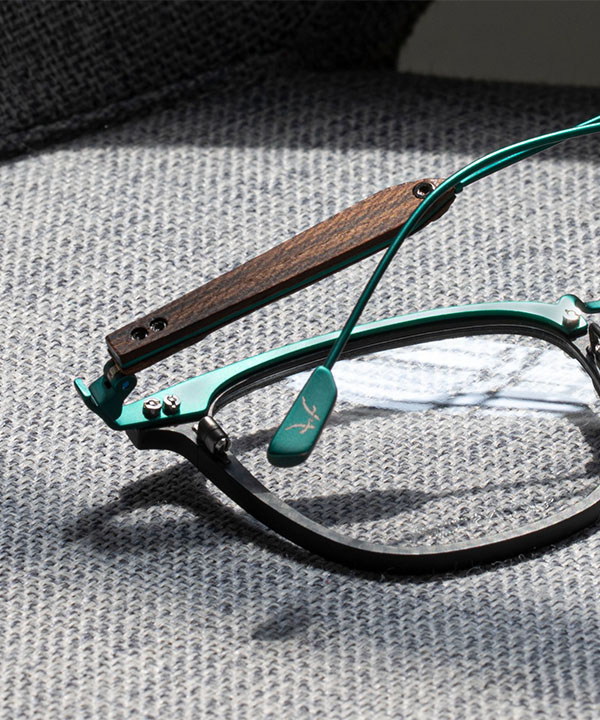
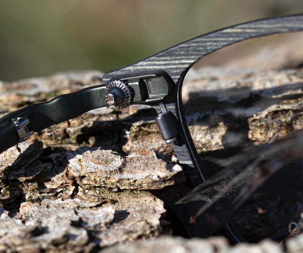
The defining character of the Scion collection emerges through metal textures that reflect the layered, time shaped surface of cedar bark. These textures are not merely decorative. They are intentionally placed design elements meant to be experienced through touch as much as through sight. Accompanying these surfaces are decorative metal pins inspired by metal details once used in samurai ceremonial attire. Historically symbols of inner discipline and quiet resolve, these elements transform into understated expressions of balance and composure within the Scion models. Unsuikyo’s three stage adjustable temple tip system provides personalised fit while preserving the collection’s calm aesthetic language. In Scion, these details evolve into contemporary symbols that echo the honour and serenity traditionally associated with the sacred cedar tree. Lightweight materials, precise engineering, and adjustable temple tips come together to form a balanced whole that allows this nature driven inspiration to be felt in daily life. Comfort is not treated as a secondary feature, but as an integral part of the design philosophy. All of these technical innovations move in harmony with the brand’s natural and refined aesthetic direction.

Five Designs, One Enduring Spirit
Each model within the collection interprets the spirit of cedar from a different perspective while successfully maintaining overall harmony. Scion M1 reflects the grounded silhouette of an ancient cedar trunk. Its sharp rectangular frame and textured metal temples evoke the deep grooves of aged bark, offering a balanced and confident presence. Scion M2 draws inspiration from the natural curves of cedar branches. Its rounded frame and wood grain inspired metal bridge create a softer expression, while the metal temples reference the organic lines of cedar bark. Featuring balanced colour transitions and refined detailing, M2 is also the design that earned Unsuikyo the Japan Eyewear Award 2026, Grand Prix. Scion M3 stands out with its lightweight and comfortable profile designed for everyday wear. Its subtle panto inspired form and finely detailed temples recall the gentle movement of wind passing through cedar leaves. Scion M4 takes inspiration from the anchoring strength of cedar roots, offering a structure suitable for wider facial proportions. Its solid construction and engraved details create a sense of depth and balance. Scion M5 interprets sunlight filtering through the cedar canopy during winter. Its transparent and biodegradable frame reflects the clarity of light passing through branches and is completed with delicate snowflake inspired textures. Although it uses no natural materials, M5 presents an elegant design that evokes nature through both form and spirit.

Source: The Optical Journal

February 2026

Mykita

Engineered Minimalism, Evolving Aesthetics

Mykita

From material innovation to quietly radical design, Mykita continues to redefine contemporary eyewear through precision engineering, refined aesthetics, and a forward-looking approach that seamlessly bridges optical and sun collections.

Mykita has established itself as a contemporary design authority in eyewear, widely regarded as a reference point for precision-driven innovation and independent thinking. Founded in Berlin in 2003 by Moritz Krueger, the brand operates at the intersection of engineering, craftsmanship, and progressive aesthetics, supported by a fully integrated production model in which all collections are handmade at the Mykita Haus, enabling complete control over design and manufacturing while remaining uncompromising in its values. Rather than following seasonal trends, Mykita has built its reputation through a holistic design philosophy rooted in material research, technical refinement, and interdisciplinary collaboration, where patented engineering solutions and a tailored approach to form and fit result in eyewear that feels purposeful, enduring, and precisely considered. This commitment, reinforced by transparency around environmental and social responsibility, continues to strengthen the brand’s global credibility, positioning Mykita as one of the most influential and fast-growing reference names in contemporary eyewear. Entering 2025, Mykita expanded its design narrative through a series of clearly defined launches, including Amber Havana, Mykita RX Lessrim, and the Lite Powder collection. Each concept introduced a distinct material or surface exploration, reinforcing the brand’s commitment to precision, reduction, and refined aesthetics across optical frames. As the year progresses toward its close, these launches collectively reflect a period of focused development and creative clarity, setting the tone for a seamless transition into the next design chapter. Looking ahead, Mykita approaches 2026 with a sense of continuity rather than disruption. The direction feels assured and forward-moving, guided by the same principles of restraint, material intelligence, and technical elegance. Without the need for overt statements, the brand signals an evolution shaped by confidence, depth, and a clear understanding of its design language.

A Productive Year, Defined by Purpose
Throughout 2025, Mykita has demonstrated a confident design momentum, expanding its collections through carefully considered concepts that explore material, surface, and proportion. One of the last year’s standout developments comes in the form of Amber Havana, a contemporary reinterpretation of tortoiseshell. Deep amber tones enriched with subtle red inflections bring warmth and depth to acetate frames, offering a modern expression of a timeless eyewear staple. The colour story feels bold yet restrained, designed for wearers who embrace colour with quiet confidence. Combined with Mykita’s Acetate design language and the integrated Endura hinge, these frames balance refined aesthetics with engineered comfort and long-term resilience.

Precision takes centre stage in Mykita Rx Lessrim, a collection that reimagines rimless eyewear through a distinctly modern lens. Stripped of traditional conservatism, Lessrim introduces an ultra-fine stainless steel rim that delicately traces the lens edge, creating an almost invisible silhouette. The result is eyewear that enhances natural expression rather than dominating it. Refined metallic hues and subtle bicolour combinations contribute to an understated luxury, while the near-weightless construction delivers all-day comfort. Lessrim stands as a clear expression of Mykita’s ability to rethink established categories through design clarity and technical finesse. Another defining chapter of 2025 is Mykita Lite Powder, set for release in October. With its pioneering use of powder coating in eyewear, the collection introduces a new surface language that challenges conventional stainless steel aesthetics. The innovative finish allows for a distinctive colour palette while maintaining the Lite collection’s signature lightness. Subtly convex forms create a soft, rounded three-dimensional presence, evoking traditional wireframe glasses while pushing them into unexpected chromatic territory. Pastel tones and clear powder coatings over champagne gold add depth and tactility, reinforcing Mykita’s material-driven approach to progressive design.

Brand Codes Evolving This Season
Building on this momentum, Mykita enters 2026 with a series of launches that extend its design philosophy into new expressions for both sun and optical eyewear. Lessrim Sun translates the precision of the optical concept into a capsule of sunglasses defined by clarity, reduction, and a quietly radical edge. The ultra-thin stainless steel rim disappears into the lens groove, creating a sleek and near-invisible outline. A restrained palette of dark matt tones, subtle metallics, and sophisticated bicolour contrasts reinforces the collection’s cosmopolitan character. Five unisex shapes interpret the Lessrim language through distinctive geometries, enhanced by gradient lenses that add depth without overpowering the minimalist architecture. The result recalls contemporary jewellery in its balance of understatement and character. With Lite Acetate Sun, Mykita introduces a sculptural exploration of acetate infused with a Seventies sensibility. Warm Amber and deep Black Havana fronts set an atmospheric tone, while the brand’s signature hybrid construction pairs expressive acetate with sleek stainless steel temples. The silhouettes reference iconic shapes through a distinctly modern filter, resulting in sunglasses that feel polished, lightweight, and effortlessly wearable. Retro cues are present, but always refined, reflecting Mykita’s ability to balance nostalgia with precision engineering. Colour takes a bolder turn in Lite Powder Optical Neon Pink, where the collection’s minimalist wireframe aesthetic meets a vivid new hue. Joining the existing pastel palette, Neon Pink brings an unexpected energy to Mykita’s powder-coated silhouettes. In the campaign, the new color introduced on the panto-shaped Aita model from the Lite Powder frames also extends to the other two designs in the series, the aviator Tosca and the hexagonal Santo. Lightweight, modern, and playful, the concept reinforces Mykita’s willingness to challenge visual codes without compromising design integrity.
January 2026

Anna Sui

Setting the Fashion Agenda

Anna Sui

Anna Sui’s Spring/Summer 2026 collection, Desert Blooms, is built on artistic freedom, unexpected encounters, and an alternative way of living…

Launching her namesake brand in New York in the early eighties, Anna Sui blends her design approach with vintage spirit, rock-and-roll energy, and the city’s vast archive of cultural references. Holding her first runway show in 1991, Sui went on to build a strong brand universe that now spans ready-to-wear, cosmetics, fragrances, and accessories. By merging vintage styles with contemporary cultural influences, she creates effortlessly cool, vibrant, and original fashion pieces. Whether her inspiration stems from the Victorian era, iconic figures like Andy Warhol, or Finnish textile elements, her designs always reflect the depth of her cross-cultural knowledge. A true trendsetter whom stylists and global fashion editors consistently look to for direction, Sui’s boundless energy and creative brilliance make her runway shows perennial highlights of New York Fashion Week. Her influence on fashion is recognized not only through her collections but also through the global museum exhibitions dedicated to her creative legacy. Prestigious accolades such as the CFDA Perry Ellis Award and the Geoffrey Beene Lifetime Achievement Award further reinforce the designer’s enduring place on the global stage, particularly within American fashion.

Richness of Shapes, Colors, and Patterns
Looking at Anna Sui’s eyewear segment, it becomes immediately clear that this category is where her overall aesthetic is expressed most directly. Brought to life in 2010 in collaboration with Mondottica International, Anna Sui Eyewear offers a comprehensive product range including sunglasses, optical frames, and-since 2025-contact lenses. The designs carry the brand’s long-established signature details: rosebud and butterfly motifs, elegant fretwork patterns, lace-like textures, laser-engraved accents, and a decorative approach often rooted in nostalgic references. What sets Anna Sui Eyewear apart is its unwavering commitment to individuality. Through unexpected cat-eye angles or round silhouettes adorned with baroque-inspired touches, each design tells a story. Created for those who dare to blend nostalgia with a hint of rebellion, Anna Sui eyewear pieces serve as reflections of personal style. With unique collaborations and seasonal capsule collections, the line remains continually dynamic, fresh, and collectible.

The brand’s eyewear collections span a wide aesthetic range-from minimal, chunky acetate frames to delicate metal styles; from modern cat-eye interpretations to oval silhouettes. Sui’s theatrical, color-focused, and romantically gothic sensibility is distinctly felt in these designs. Embossed temple details, rhinestone embellishments, baroque influences, and vintage-inspired patterns elevate the eyewear into highly collectible pieces. For Sui, eyewear is not merely a finishing accessory; in her “head-to-toe style” philosophy, it is a defining expression that draws the eye to the face. The Anna Sui Eyewear user is defined as someone confident in their style-someone who blends femininity with boldness, and who sees color and pattern as part of their personal signature. Each model carries a design language that merges a romantic world with free-spirited attitude. Because Sui consistently balances nostalgia with modernity, the global fan base she has cultivated over the years embraces her eyewear collections with the same enthusiasm. In this sense, Anna Sui Eyewear not only offers fashion accessories but also gives wearers space to craft their own style stories.

Welcoming 2026 with Blooms
Anna Sui’s Desert Blooms collection for Spring/Summer 2026 was presented at the Hotel Chelsea. The collection brings the designer’s deep connection to artistic inspiration back into focus. Sui draws from the home of Mabel Dodge Luhan in Taos, New Mexico-a place considered a creative haven in the early 1900s, where artists such as D.H. Lawrence, Georgia O’Keeffe, Ansel Adams, Martha Graham, and Millicent Rodgers gathered in an atmosphere of open expression and artistic freedom. Later, in the 1970s, Dennis Hopper purchased the home, turning it once again into a creative magnet for a new generation of artists and filmmakers. For Sui, this legacy resonates with the legendary creative community of Hotel Chelsea, making the venue a symbolic extension of the collection’s spirit. Desert Blooms is built upon the artistic freedom, unexpected encounters, and alternative lifestyle aesthetics that connect these two worlds. Anna Sui Eyewear enhances the apparel collection beautifully with its Desert Blooms sunglasses. The collection’s signature butterfly shape returns for Spring/Summer 2026 with two distinct interpretations. One features soft pastel tones adorned with seashell and star details, while the other embraces striking gradient hues, shimmering strass embellishments, and a pronounced butterfly silhouette. Both designs capture the enchantment of desert twilight, a romantic imagination, and a uniquely modern sense of style. Staying true to the overall aesthetic of the Desert Blooms ready-to-wear collection, these sunglasses offer an accessory experience that feels both whimsical and contemporary. With their strong visual identity, they bring a fresh breath into the world of Anna Sui, continuing the brand’s celebration of creativity, color, and character-from the runway to optical boutiques.

Source: The Optical Journal

December 2025